 Aug 25 / 2026
A website is no longer just an online presence; it is a powerful tool for attracting customers, building trust, and generating leads. In 2026, businesses need websites that deliver fast, seamless experiences across smartphones, tablets, laptops, and desktop devices.
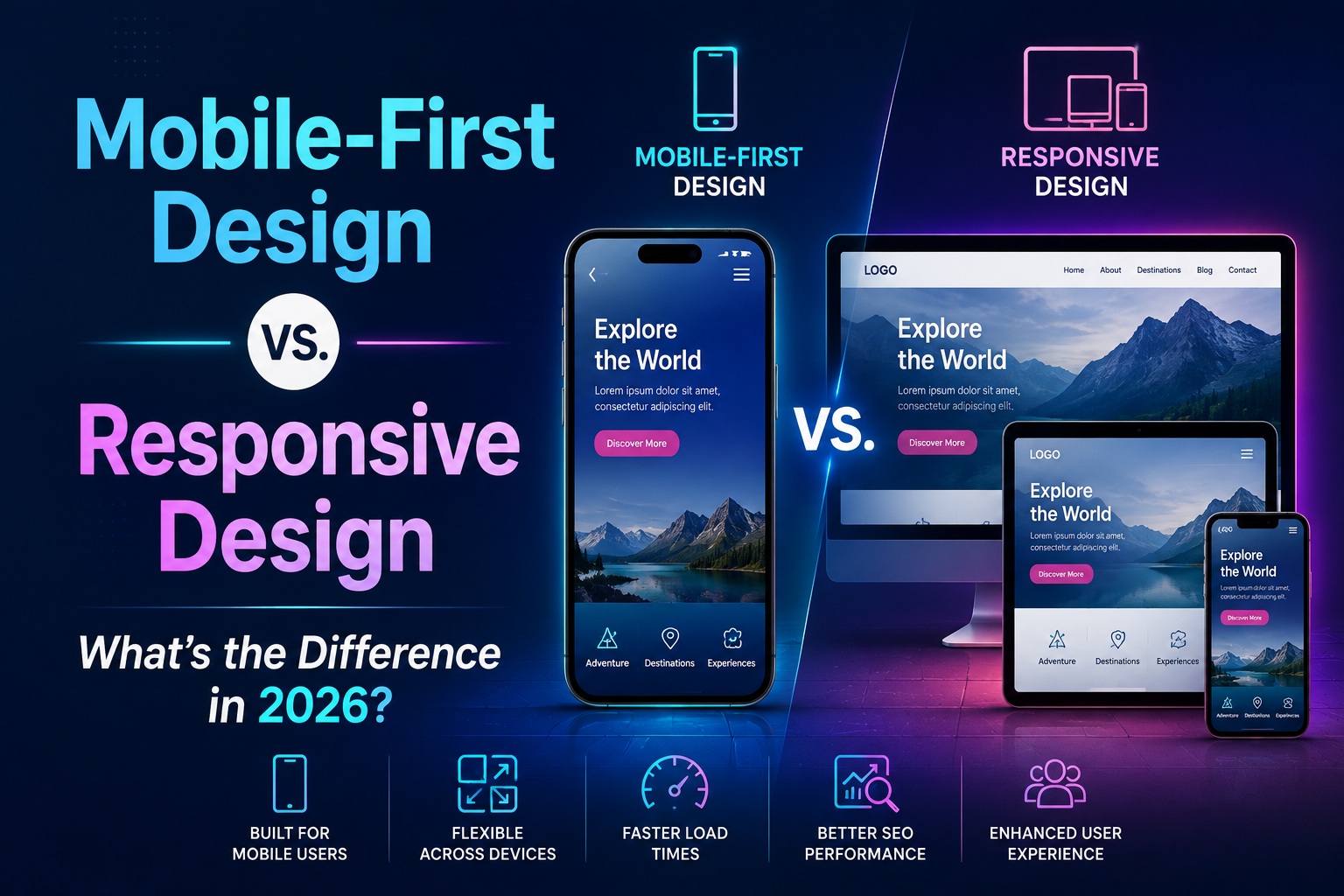
When planning a new website, small businesses need to understand an important distinction: What is the difference between mobile-first design and responsive design?
While both approaches aim to create websites that work well across different devices, the design process and priorities are different. Understanding these differences can help businesses choose the right website development strategy to improve user experience, search engine rankings, and conversions.
In this guide, we will compare mobile-first web design vs. responsive web design, explain their benefits, and help you understand which approach is best for your business website in 2026.
What Is Mobile-First Design?
Mobile-first design is a website design approach where developers and designers create the mobile version of a website before designing larger screen versions.
Instead of starting with a desktop website and making it smaller for mobile devices, mobile-first design begins by creating a mobile-friendly website that prioritises the most important content, features, and actions for smartphone users.
This approach follows the principle of progressive enhancement, where additional features and layouts are added as screen sizes increase.
A mobile-first website typically focuses on:
Since a large percentage of internet users browse through smartphones, mobile-first web design has become an important part of modern website development.
What Is Responsive Web Design?
Responsive web design is a method of creating websites that automatically adjust their layout based on the user’s screen size and device.
A responsive website uses flexible layouts, responsive images, CSS techniques, and adaptable design elements to provide a consistent experience across devices.
For example:
The goal of responsive web design is to make one website work effectively across multiple devices without creating separate desktop and mobile versions.
Mobile-First Design vs. Responsive Design: Key Differences
While both approaches improve website usability, they differ in their development strategy.
| Feature | Mobile-First Design | Responsive Web Design |
| Design approach | Starts with mobile screens | Adapts across all screen sizes |
| Main priority | Mobile experience first | Consistent device experience |
| Development process | Progressive enhancement | Flexible adaptation |
| Performance focus | Usually optimised for speed | Depends on implementation |
| Content strategy | Prioritises essential content | Adjusts existing layouts |
| Best for | Mobile-focused audiences | Businesses targeting all devices |
Benefits of Mobile-First Web Design
-
Improved Mobile User Experience
A mobile-first website is designed around how smartphone users browse, search, and interact. This creates a smoother experience with easier navigation and clearer messaging.
A better mobile experience can increase:
-
Better Website Performance
Website speed plays an important role in user satisfaction and SEO performance.
Mobile-first design encourages businesses to prioritise:
A faster website helps reduce bounce rates and improves overall user experience.
-
SEO Advantages
Search engines focus heavily on mobile usability when evaluating websites.
A mobile-first website supports SEO goals by improving:
Businesses investing in SEO-friendly website design can gain better visibility and attract more organic traffic.
Benefits of Responsive Web Design
-
Consistent Brand Experience
Responsive web design ensures customers receive a similar experience regardless of the device they use.
This helps businesses maintain:
-
Easier Website Maintenance
A responsive website uses one website structure instead of separate desktop and mobile versions.
This makes it easier to:
-
Future-Ready Website Development
With new devices and screen sizes constantly emerging, responsive websites can adapt more easily to changing technology.
Why Mobile-First Design Is Important for Businesses in 2026
Consumer behaviour has changed. People now search for services, compare products, read reviews, and contact businesses directly from their smartphones.
A website that is difficult to use on mobile devices can result in:
Modern businesses need websites that are:
A mobile-first approach helps businesses create digital experiences that match customer expectations.
Is Responsive Design Still Important in 2026?
Yes. Responsive web design is still a critical part of website development.
However, many businesses now combine both strategies by using mobile-first responsive design.
This approach means:
- The website structure starts with mobile users.
- Responsive techniques ensure the website works across all devices.
- Performance and usability remain priorities.
For most businesses, combining mobile-first thinking with responsive development provides the best results.
Mobile-First vs. Responsive Design – Which Suits You Better?
The right choice depends on your business goals and audience.
Mobile-First Design Is Best For:
Responsive Design Is Best For:
A professional website development company can help identify the best approach based on your audience, industry, and business objectives.
LBN Tech Solutions
The debate between mobile-first design vs. responsive design is not about choosing one and ignoring the other.In 2026, successful websites combine mobile-first thinking with responsive technology, and that’s exactly what we create at LBN Tech Solutions. Our expert website development services are designed to help you attract more visitors, improve SEO rankings, and generate more leads with a website that is fast, user-friendly, and optimised for every device. Contact us to map out a strategy and build a website that helps your business grow.
Frequently Asked Questions
Is mobile-first design better than responsive design?
Mobile-first design is often better for businesses that want improved mobile performance and user experience. However, responsive design remains important for supporting different devices.
Can a website be both mobile-first and responsive?
Yes. Many modern websites use mobile-first responsive design to deliver fast and flexible experiences.
Does mobile-first design improve SEO?
A mobile-first website can support SEO by improving mobile usability, website speed, and user experience.
Is responsive web design outdated in 2026?
No. Responsive design remains an essential website development practice. It is often combined with mobile-first strategies.
Categories
- Listings, Reviews, Mentions: Which Signal Matters Most to AI?
- Ads in ChatGPT: What They Are, How They Work, and What It Means for Small Businesses
- Can AI Recommendations Be Manipulated? What Small Business Owners Need to Know in 2026
- The AI Content Overload Problem: How Smart Brands Win Without Posting More in 2026
- The AI Layer of Social Media: What’s Really Happening Behind Every Scroll
- Reddit Marketing 101: An Intro to the Platform
- LLMs.txt and Google Search: What Marketers Really Need to Know in 2026
- Can AI Content Rank on Google? Myths, Facts, and New Updates in 2026
- Schema Markup: The Hidden Signal Helping Content Rank, Get Cited, and Show Up in AI Overviews
- AI Overview Optimisation: The New Frontier of SEO (and How We’re Winning It)
- Zero-Click Searches and Their Impact on Content Writing and Blogging Services
- From Keywords to Intelligence: The SEO–AI Evolution by 2026
- Is SEO Really Dead, or Has It Simply Evolved into Fuel for AI?
- The “See It, Want It, Buy It” Loop: How Fast Decision Cycles Are Quietly Rewriting Marketing (And What Small Businesses Must Do Now)
- Why Monthly Newsletters Still Work (And How to Make Yours Stand Out)
- The Ultimate Guide to Content Repurposing – The Underrated SEO Factor
- How Does Video Content Help Improve SEO?
- Top 12 Reasons Why Your Website Needs a Blog Corner
- Difference Between Copywriting and Content Writing
- Content Marketing – A Modern Guide for 2023
- What Is the Difference Between Content Marketing and Content Strategy?
- How to Write Compelling Headlines in 3 Steps
- Marketing in the Attention Economy: Why Capturing Attention Is Harder Than Ever (And What Smart Businesses Are Doing About It)
- Google Kills &num=100: Good or Bad for SEO?
- Brand Loyalty – Why Does It Matter and How to Build It?
- 5 Ways to Convert Your Visitors into Customers
- How to start a digital marketing agency from scratch and run it successfully? | Part 2
- How to start a digital marketing agency from scratch and run it successfully? | Part 1
- Digital marketing tips for preschool owners
- What are brand pillars, and why do they matter?
- How to Get the Results You Want Through Your Digital Marketing Plan?
- Demystifying the Debate Around Influencer Marketing (How to Do It Correctly)
- How to Use Customer Service as an Online Marketing Strategy
- The Importance of Commenting in Forums for SEO
- What Is Moltbook? All Your Questions Answered About the Strange New Social Media for AI
- 4 Digital Marketing Incidents Everyone’s Talking About: Outages, Scams, Malware & Analytics Chaos
- Google Algorithm Updates – March 2024
- Google Ranking Algorithm Updates – February 2024
- Top Search Engine Marketing Tools to Use to Save Time and Money – Part 2
- Google Ranking Algorithm Updates – September & October 2023
- Top Search Engine Marketing Tools to Use to Save Money and Time – Part 1
- Google Ranking Algorithm Updates – August 2023
- Google Ranking Algorithm Updates – July 2023
- Google Ranking Algorithm Updates – June 2023
- Google Ranking Algorithm Updates – May 2023
- 10 Cool Things You Could Do with ChatGPT
- ChatGPT Is at Capacity Now – How to Fix This Error?
- ChatGPT – Is It the Future or Just the Latest AI Fad?
- 5 Ways Technology Might Be Blocking Your Business Progress
- Trends That May Shape the Future of Digital Marketing
- The Significance of Meta Description in 2024
- What are the 9 basic rules Google follows for Featured Snippets?
- What is agile marketing?
- How will Core Web Vitals enhance SEO in 2024?
- Digital Marketing Trends for 2024
- What Are the Major Elements of an Ideal E-Commerce Website?
- Ecommerce Website: Benefits, Working and Development Process
- Choosing the Right E-Commerce Web Development Company: A Comprehensive Guide
- E-Commerce Site Search – Best Practices to Increase Conversion (Part – 2)
- E-Commerce Site Search – Best Practices to Increase Conversion (Part – 1)
- What Is E-Commerce Merchandising and How Can It Help Improve Sales?
- Top 5 Reasons Why Your Business Needs a Website in 2023
- How to Write a Product Description for eCommerce Websites
- Types of Ad Fraud and Invalid Traffic: A Complete Guide for Businesses
- Meta Andromeda Explained: Why Small Brands Need to Rethink Meta Ads Now
- Google’s New ‘Sponsored Results’ Update – What Businesses Should Know Now
- How to Create a Demand Generation Campaign in Google Ads
- Demystifying Demand Gen Ads: Understanding the Power of Awareness and Engagement
- Why Is Search Engine Marketing Important?
- Google Ads Checklist for 2024
- Difference between Organic and Paid Search Results
- Essential Rules and Strategies for Effective Healthcare Content Marketing
- Healthcare’s Content Revolution: Statistics and Strategies for Reaching Today’s Patients
- Healthcare Marketing: Loyalty-Building Techniques and Basic Healthcare Marketing Content Ideas
- The Essential Guide to Content Marketing for Modern Healthcare Organizations
- Healthcare Marketing through the Ages: The Vital Role of Digital Transformation
- Setup GA4, Search Console & Tag Manager with Expert Help from LBN Tech Solutions
- Get Found on Facebook, Instagram, X, and LinkedIn – Professionally Set Up by Experts
- Brand Yourself with Every Email – The Power of a Custom Email Signature by LBN
- Why You Need a Domain and Branded Email – Even Without a Website
- The Pareto Principle of SEO: Why Small Businesses Should Stop Trying to Fix Everything at Once
- 9 Beginner Mistakes Most Small Businesses Make in SEO
- 11 Actionable On-Page SEO Factors You Need to Know
- Cracking the Code: Mastering On-Page SEO for Website Excellence
- Off-Page SEO – Best Short-Term and Long-Term Strategies to Employ
- Off-Page SEO Ranking Factors That Everyone Should Know About
- Off-Page SEO – What Is It and How Can You Get the Best Out of It?
- Top 5 SEO Mistakes to Avoid
- What to Expect from a Professional SEO Company?
- What is the Role of SEO in the Web Design/Development Process?
- Is Trying To Rank SEO without an SSL (HTTPS) Pointless?
- How We Brought Down the Bounce Rate from 93% to 5% (Case Study)
- How to Rank Higher on Voice Searches
- The ‘Proof Loop’: How Customers Cross-Check Businesses Before Choosing You
- Best AI Tools for Small Business Marketing in 2026: The Complete Guide for Owners Who Are Tired of Being Outspent
- 11 Reasons Why Having an E-commerce Website Is More Important Than Ever
- 5 Mobile Marketing Techniques That Can Grow Your Business
- Lead Generation Basics for Small Business Owners
- How to Conduct a Competitive Analysis?
- How to Win Social Media Without Posting Daily
- How TVK won Tamilnadu in 2026: The strategy, the story and the business lessons
- Empowering Women in Digital Marketing: Job Opportunities, Career Paths, and Top Interview Questions Answered
- How to Market using Social Media for Different Generations
- Tips to Handle Digital Branding Like an Expert
- WhatsApp Ads Decoded: Everything You Must Know About This Marketing Game Changer
- Digital Marketing vs. Digital Branding – What’s the Difference?
- Website vs. Social Media: Is a Website Still Necessary for a Business?
- What Should Small Businesses Post on Social Media? (A Complete Guide)
- The making of the first ever Digital Women Economic Forum
- Schema Markup: The Hidden Signal Helping Content Rank, Get Cited, and Show Up in AI Overviews
- Schema Mark-up in SEO: A Guide to Types, Benefits, and Importance
- How to Track Website Calls and Email Clicks in GA4 Using Google Tag Manager
- How to Set Up Google Tag Manager: A Step-by-Step Guide
- What is Google Tag Manager? How does it work and what are the Benefits of using Google Tag Manager?
- The Ultimate Guide to Profile Page Structured Data
- Mastering Schema Markup: Unravelling the Secrets of Schema, Supported Formats, and Implementation
- Reasons Why Google May Penalize Your Website
- Mobile-First Design vs. Responsive Design – What’s the Difference in 2026?
- Top 10 CMS Platforms for Website Design and Blogging
- Website Redesign Mistakes to Avoid – Professional Website Redesign Services
- 10 Clear Signs Your Website Needs a Redesign and Why It’s a Smart Investment
- The Importance of UI/UX Design in Web Development
- What Are the Phases Involved in Web Development?
- A Beginner’s Guide to Web Development
- What Is CMS and How Can It Be Used in Website Development?
- Why Should You Consider Redesigning Your Website?
- What Is the Process of Web Design and How Does It Differ from DIY Solutions?
- Web Design Trends of 2026 – What Small Businesses Need to Know